- Jobs
 ResumeCreate your job-winning resume using our free resume builder.
 PortfolioShowcase your skills and projects with a professional portfolio.ResumeCreate your job-winning resume using our free resume builder.Resume BuilderMake a resume for free.Resume TemplatesAccess our extensive library of professional & ready-to-use templates.Resume ExamplesGet inspired by real resume examples to create your own.Occupation GuideAccess resume writing guides tailored for different professions.Resume HelpGet expert advice on all things resume from our team of recruitment specialists.
- ResourcesSuccess StoriesBusiness ExcellenceAbout CakeResumeFeatured Reads
- Hire
- Download our App


Gap minder practice

Gap minder practice
Web Developer
・
Taipei City, Taiwan
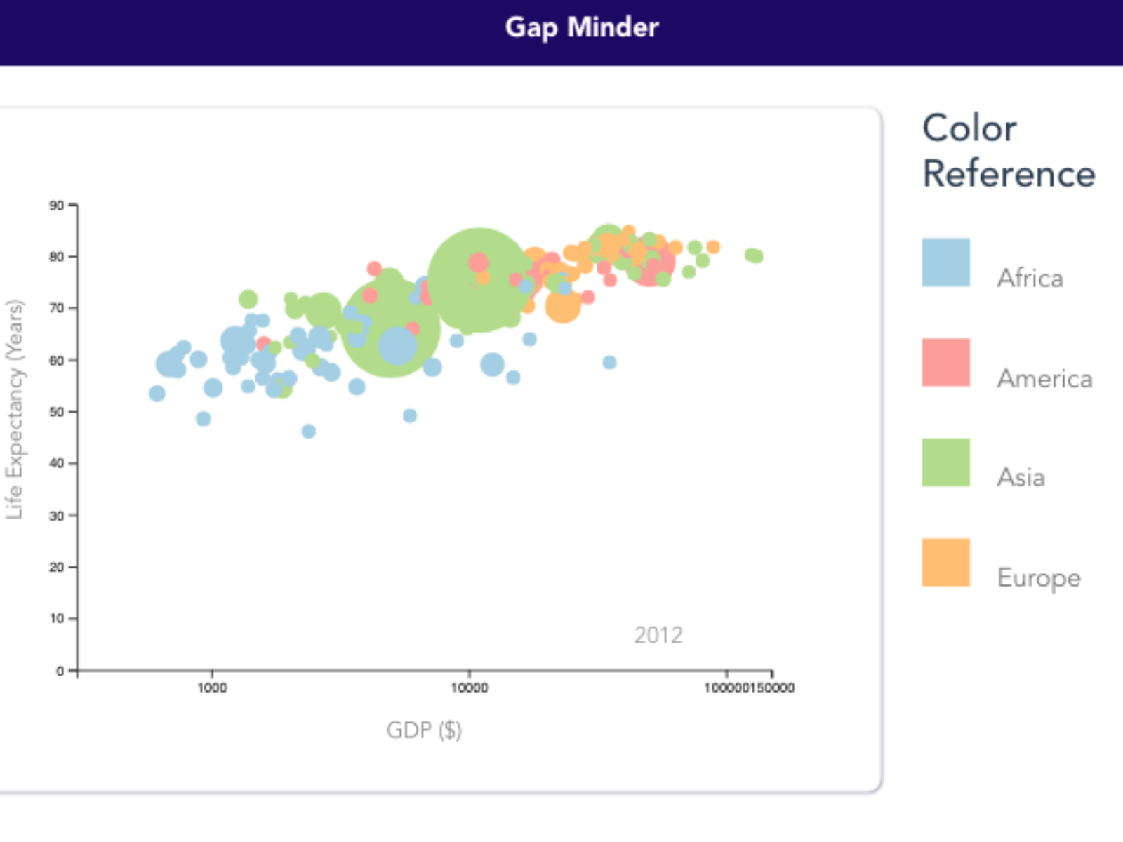
The graph shows the world's GDP and life expectancy condition which can be divided into four continents in four colors. Each circle represents each country. The bigger area of the circle means the population is higher.
https://github.com/yuningc0325/d3Collections
Please login to comment.