- Jobs
 ResumeCreate your job-winning resume using our free resume builder.
 PortfolioShowcase your skills and projects with a professional portfolio.ResumeCreate your job-winning resume using our free resume builder.Resume BuilderMake a resume for free.Resume TemplatesAccess our extensive library of professional & ready-to-use templates.Resume ExamplesGet inspired by real resume examples to create your own.Occupation GuideAccess resume writing guides tailored for different professions.Resume HelpGet expert advice on all things resume from our team of recruitment specialists.
- ResourcesSuccess StoriesBusiness ExcellenceAbout CakeResumeFeatured Reads
- Hire
- Download our App


10 Best Fonts for a CV to Create an Eye-catching CV
In this article, you will read about:
According to HR experts, a curriculum vitae (CV in short) is scanned by recruiters for an average of only 6 seconds, before going to either the “interview” or “bye-bye” pile. This means that choosing the right fonts to use for CV is crucial in determining whether or not you get that interview.
With that said, if you are now searching for the best font to use for CV writing – whether you are looking for the best practices on CV typography, or just references on the standard CV font size, then you are on the right track to a good CV!
This article will explain all the important information you need to help you choose your ideal font for your CV, including: the best CV font sizes, pros and cons of 10 font types, recommended styles – plus some bonus tips at the end to help make your CV stand out more.
Why Is the CV Font Important?
The fonts used in your CV will determine their first impression towards you.
This is a sad truth, but the fonts used in a CV indirectly show your personality and determine whether or not you give off a good (or bad) first impression to the recruiters. Just like how wearing a clean suit creates a far better image of you, than wearing a Hawaiian shirt and pants to an interview. And by personality, for example, using a clean and good font for your CV shows that you pay attention to details and consideration to others.
The right CV fonts lets recruiters focus on the content.
Let’s face it, humans are visual beings. Choosing a nice font for CV will allow recruiters to look at your CV more thoroughly, instead of thinking that there are better CV fonts to use – all because you have the idea that squiggly fonts in a CV show how outgoing you are. And who knows, choosing CV fonts that are easy on the eye just might give your CV a longer screen time.
The right fonts for CV can help with passing the ATS scanner.
Yes, you read that right. Companies that receive a large number of CVs use a system called an ATS (applicant tracking system) to filter out CVs before showing them to the human decision makers. According to Jobscan, 98% of 500 Fortune companies use ATS, which is why choosing a good font for your CV, keeping consistent formatting for the same categories like headings, dates and positions, are important for your CV to pass the ATS first, then be seen by a human recruiter.
What Is the Best Font for a CV?
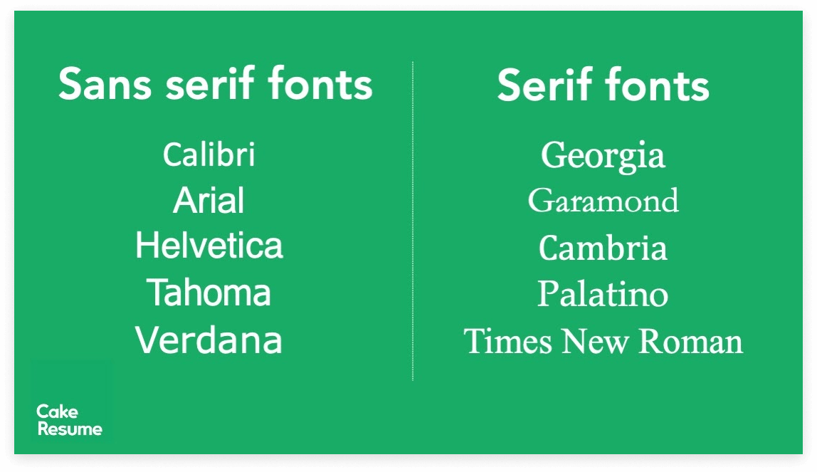
Before choosing the fonts to use for your CV, you should know that fonts are generally categorized into 2 font types, serif and sans serif. A Serif is an ornamental stroke at the tail of a letter, which causes the font to have a more decorative feel to it. Sans serif, on the other hand, does not have that decorative tail and has the same width for all the letters.
Below are 10 of the safest, professional CV fonts that are suitable as fonts to use for CV, along with each of their pros and cons.
1. Georgia
Georgia is a really good alternative for Times New Roman, the font seen as “overused” for most people. During the nineties, webmasters designed the font Georgia, with the purpose of being compatible with all types and sizes of screens, and it still is up until now. Georgia has a more modern and fun look, even The New York Times uses Georgia in their publications!
Pros:
- Georgia is one of the best fonts to use in CV, as it is designed to be readable on all screens and resolutions.
- It’s a free font, and is easily accessible across platforms.
Cons:
- The numbers have the same height as the letters, with the bottom of the letter exceeding the underline.
2. Garamond
If your job is design-related or requires a little bit of an “artistic touch”, Garamond is the recommended font for your CV. It was created in the 15th century and has been widely used by advertisers as it creates a prestige image for the brand, which is why established brands like Neutrogena and Rolex both use this font!
Pros:
- It has all the requirements to be one of the best fonts for CV design: easy to read, elegant and relatively novel, as it’s not something everyone uses.
- This font takes up very little space, which is a bonus if you’re trying to condense your CV content into one page.
Cons:
- Garamond was created and used from the 1400s, so it might have an older design compared to modern fonts created more recently.
3. Calibri
This typeface is a professional font for CV and is known for having a more modern look, making it one of the best fonts for a CV. This font is even a default font in Microsoft Word and its other programs.
Pros:
- It is ATS-friendly, meaning that your CV will have a higher chance of being rendered correctly.
- Calibri is one of the safest fonts to use, especially if you want the recruiter’s eyes to pass right over design and dive right into the content.
Cons:
- It’s a default font, which means that your fellow competitors might also be using the same font, which will make your CV stand out less.
4. Arial
Arial is one of the fonts most frequently found on the web. If you are planning to use a sans serif type font, Arial is your safest bet as it’s one of the classic fonts for CV, just like Times New Roman.
Pros:
- It is ATS-friendly, meaning that your CV will have a higher chance of being rendered correctly.
- It has a narrow-type alternative “Arial Narrow” which can help you save space in your CV!
Cons:
- It’s one of the standard fonts to use in CV, which means that your fellow competitors might also be using the same font, which will make your CV stand out less.
5. Cambria
Cambria is a blockier serif font “designed for on-screen reading and to look good when printed at small sizes,” as Microsoft states. As this font was created back in 2004, it remains as one of the more “traditional” fonts for CV design.
Pros:
- Cambria is easy on the eyes, especially helpful for readers to quickly read through smaller text sizes.
- It’s a default-type font, and is easily accessible across platforms.
Cons:
- It is often depicted as “traditional,” which might make it your fourth or fifth choice if you’re looking for more modern CV fonts.
6. Helvetica
Helvetica is a font that is widely used in the advertising industry. It’s a beautiful, easy-to-read sans serif font and is used by big brands like BMW, Microsoft and American Airlines in their corporate logos.
Pros:
- If you want to play safe with a sans serif font, but still want to go for that gorgeous and modern feel, Helvetica is one of the best fonts to use for a CV.
- Bolded Helvetica will give your text very thick strokes, making it more noticeable if you’re using it for your headings.
Cons:
- Helvetica comes preloaded on Mac operators, but it’s not listed in Microsoft Word. You’re going to have to purchase it if you don’t have a Mac.
7. Tahoma
Tahoma looks more compact and round than other fonts, and contains 2 versions: the regular and bold version. It is a sans serif type font often used as a substitute for Arial and Verdana, and is widely used due to its clean and professional look.
Pros:
- It has a slight technical feel to it and is a good font for a CV for engineers.
- It has a very easily distinguishable bold version, which gives a clean look to things you want to emphasize on your CV, for example, the headings.
Cons:
- It’s one of the standard fonts to use in CV, which means that other job seekers might also be using Tahoma, making your CV stand out less.
8. Verdana
This font is commissioned by Microsoft, designed for the main purpose of being readable in both low resolution and small screens. Which might be why it has wider spacing in between its letters, making it look stylish, clean and a good font for a CV.
Pros:
- Verdana has a very heavy bold option if you want to create high-impact headings.
- It has a wide spacing and is designed for readability on small screens at small resolutions, enabling you to squeeze in more text in your CV.
Cons:
- As one of the standard fonts to use for CV, Verdana looks highly similar to Arial, which will make it difficult for your CV to stand out.
9. Palatino
Palatino is an elegant serif font used by many. It works great as an alternative to Times New Roman, a widely used font which everyone is starting to get bored of.
Pros:
- The regular Palatino gives off an elegant and clean look, making it a good font for a CV.
- It has wider spacings between its letters, making it one of the more readable fonts for CV compared to other serif type fonts.
Cons:
- The italic version of Palatino almost looks like a script-type font, which is not recommended for a clean-looking CV.
10. Times New Roman
Times New Roman was one of the go-to fonts for CV many years ago, as it is one of the default fonts in Microsoft Word. It’s a classic serif type font that we all have used at least once at some point in our academic or professional experience.
Pros:
- It still remains as one of the best fonts for academic CV, due to many professors’ history with it.
- It gives off a familiar and elegant image, making it one of the top choices of fonts to use for CV.
Cons:
- As times have changed, using Times New Roman might not be the best font to use for CV, as many recruiters say that using this font implies that the job seeker is not putting extra effort on their CV.
What Is the Best Font Size for a CV?
The ideal font size for CV ranges from 10 to 16, but it varies depending on how much you want it to be emphasized in the CV. For example, the standard font size for a CV body could go down to as small as 10.5, but the headings could go up to a 16 font size. Below are the standard CV font sizes for each section and some tips!
- Name
Your name should be the most easily identifiable thing in the whole CV, and is usually the largest of all texts. The smallest is usually 16, but if you feel like it still doesn’t stand out enough, you could increase font size to up to 20, depending on the other font sizes and how much space you have. - CV Header
A common mistake is to overemphasize your CV header and make it bigger than the normal texts in your CV. They should have the same CV font size as your body text and should not be overemphasized. - Headings & Subheadings
Use from 14 up to 16 size font for headings, making sure that they are easily identifiable even at a glance. The idea is for the recruiters to be able to know how your CV is sectioned during the brief seconds that your CV is scanned. - Body Text
The best font size for cv text is 12 points, in an easy-to-read font. But if you’re struggling to fit your CV into one page, you can try decreasing the size to 10.5 at most, but under the condition that it’s still readable.
How to Choose the Best Fonts for Your CV
Now that you know the recommended fonts for CV, it’s time to start taking action on choosing the best font and size for your CV! Below are 3 simple steps:
1. Decide the theme for your CV.
Whether it is modern, simple, traditional or a little bit more creative. This will help you narrow down the fonts that you want to use.
2. Choose between Serif or Sans Serif fonts.
If you want to get more artsy for your CV, serif font might be the best font style for CV.
3. Fit your CV into one page length.
If you are struggling to do so, consider reducing the font size, changing the font, or changing the margins and spacings – All under one condition: Don’t ever sacrifice readability, especially on screen.
Tips to Create an Eye-catching CV
Other than choosing a nice font for CV, and following the ideal font size for CV, here are 5 helpful tips that can help you in your CV writing and help your CV stand out more!
💡 Avoid decorative fonts.
While handwritten fonts for CV might look cute, it might not pass the ATS, and might fail to show professionalism above all.
💡 Design an attractive CV header.
We can think of the CV header as your own name card, so make your name the biggest and contacts easily identifiable, and consider adding a colored box to make it stand out more.
💡 Use different font sizes for different text types.
For instance, you can use bigger fonts for important headings to make it easier for recruiters to identify different texts like the big headings (work experience, education, etc.), your positions, work period, etc.
💡 Avoid "thin" or "light" fonts.
Thin and light fonts can, as it might be difficult for the recruiters to read, especially when displayed on a screen.
💡 Make sections clearly identifiable.
You can do this by making the fonts bold, italic or CAPITALIZED, especially headings like work experience, education, etc.
CakeResume provides the best resume making tools & templates to help you create the perfect resume for your job hunt. Take your career journey to new heights - create a resume online (free download) now!
🔑 Key Takeaways:
- When choosing the best font size for CV, the fonts to use for CV or any decision about CV typography, there is no one absolute answer. You can take your industry’s best practices on recommended fonts for CV, and consider using or modifying it to suit your own style.
- But at the end of the day, recruiters don’t really pay that much attention to the fonts used in CV. As long as it’s readable and easy on the eye, the CV font itself shouldn’t be your main worry. With that said, keep in mind that your CV’s content matters the most, and that clean fonts for CV and consistency is key in making your CV be seen.
--- Originally written by Evelyn Peng ---
その他キャリアや採用に役立つサービス


With the intention of helping job seekers to fully display their value, CakeResume creates an accessible free resume/CV/biodata builder, for users to build highly-customized resumes. Having a compelling resume is just like a piece of cake!