- Jobs
 ResumeCreate your job-winning resume using our free resume builder.
 PortfolioShowcase your skills and projects with a professional portfolio.ResumeCreate your job-winning resume using our free resume builder.Resume BuilderMake a resume for free.Resume TemplatesAccess our extensive library of professional & ready-to-use templates.Resume ExamplesGet inspired by real resume examples to create your own.Occupation GuideAccess resume writing guides tailored for different professions.Resume HelpGet expert advice on all things resume from our team of recruitment specialists.
- ResourcesSuccess StoriesBusiness ExcellenceAbout CakeResumeFeatured Reads
- Hire
- Download our App


The Power of Resume Colors: Here are Things You Need to Know
Not the text, but it’s the overall look of your resume that employers will notice at first glance, including layout, design, font, etc. What color is best for a resume is one of the most frequently asked questions of many job seekers, especially fresh graduates.
When used correctly, resume colors can be a major advantage in making employers want to read the entire document. However, picking inappropriate colors can sometimes come across as unprofessional and cause your resume to get rejected.
Thus, pay attention to the colors used on your resume and avoid common mistakes when picking resume colors.
Table of Contents:
When to Use Color in a Resume
Is the color on a resume bad? The truth is, it is not always bad. When used appropriately, color on a resume can help you stand out and increase the overall quality of your resume.
In general, colors can help improve or reduce the readability of a resume, depending on how it is used. Adding color to your resume makes it either look more appealing or out-of-place. The answer depends on the career you’re pursuing and the position you’re applying for.
Here, we have divided professions into two categories: creative industries and formal industries.
1. Creative Industries
For certain creative careers, designing colorful CVs/resumes seems to be an exciting process.
The pros are your application can be more eye-catching, stand out from other candidates, and reflect your creativity. Using different resume colors is also a great way to draw employers’ attention to certain sections in your resume. Besides that, you can impress them better by incorporating the same color with the branding of the company into your resume.
On the other hand, some argue that color should not be a crucial part of a good quality resume. Spending too much time picking resume colors can make you forget about the actual content. It is also confusing as you may not know how many colors or what colors you should add to your resume. If you’ve got it wrong, you may lose the chance of getting to the next round.
10 creative career areas that can benefit from adding colors to CVs/resumes:
- Acting
- Advertising & Marketing
- Architecture
- Art
- Design
- Film & Video
- Photography
- Writing & Publishing
- Journalism
- Music
2. Formal Industries
If you’re working in a formal, traditional, “old school” industry, a muted color palette will make your resume more professional and easier to read. You also don't have to spend much time and effort into finding the best colors for your resume as black and white or grayscale are always a good bet.
In contrast, some employers find black-and-white CVs boring and too ordinary to read. Your CV blends into many other documents and you also can't guide them to the important parts of your application.
10 formal industries that should avoid colorful resumes:
- Administration
- Finance & Accounting
- Banking
- Law
- Education
- Engineering
- HR
- Healthcare
- Construction
- Government Officials
5 Tips for Choosing What is the Best Color for a Resume
1. Create and follow a CV color scheme
“Color scheme” is a basic term in color theory, referring to the choice of colors used in various artistic and design contexts.
To ensure the readability of your resume, it's important to stick to a CV color scheme. That means selecting a primary color for the header, a secondary color for the subheadings, and an accent color for important bits of information.
Note the following things if you wish to adopt the best color scheme for your resume:
- How many colors do you use?
- Do you use high or low contrasting colors?
- Do you want to use colors to highlight important parts?
- What colors will be used for the background, headings, and main text?
2. Refer to emotion colors to create the most fitting color scheme for your resume
Emotion colors belong to “Color Psychology” in which certain colors can affect mood and emotions.
How to choose emotion colors depends on your personal taste, the employer brand, and the industry you're working in, which can help maintain the balance between creativity and professionalism.
11 colors and the emotions they evoke:
- Black: Powerful, sophisticated, edgy
- White: Clean, virtuous, healthy
- Grey: Neutral, formal, gloomy
- Red: Passionate, aggressive, important
- Orange: Playful, energetic, cheap
- Yellow: Happy, friendly, warning
- Green: Natural, stable, prosperous
- Blue: Serene, trustworthy, inviting
- Purple: Luxurious, mysterious, romantic
- Pink: Feminine, young, innocent
- Brown: Earthy, sturdy, rustic
3. Arrange the colors hierarchically
To add professional colors to your resume, make sure you know about hierarchy, one important color theory principle. Simply put, arranging the colors hierarchically helps direct the reader's attention and makes your resume easy to navigate.
You can use an accent color for the following elements in your resume:
- Your name
- Job title/Resume title
- Headings & Subheadings
4. Select a contrasting color for subheadings and important parts
As mentioned earlier, the drawback of a black-and-white resume is you can't highlight important bits of information you want employers to notice first. Thus, you can give them a boost by choosing the right color combinations for your resume. It should be the colors with high contrast like blue-white, gray-black, etc.
Additionally, using the resume colors with high contrast can prevent your resume from being rejected by the Applicant Tracking System (ATS).
5. Refer to resume samples for the same position
No need to panic when it comes to professional resume colors. The Internet has a wide range of information and knowledge for job seekers like you - where you can find great resume examples online. By looking up other jobs resume examples created by either resume experts or applicants, you can get a sense of the best color combinations for your resume.
CakeResume provides free resume builder tools & free resume templates download to help you create the perfect resume for your job hunt. Take your career journey to new heights - create a resume online now!
Extra Tips for Creating a Good Resume with Colors
💡 Use a resume background color
When it comes to resume design, go for a white background, black for text, and a third color to place emphasis on important parts.
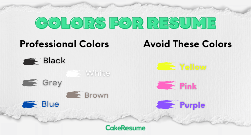
| 🟢 Professional colors for resumes/CVs: | ❌ Avoid these colors in resumes/CVs: |
| - Black - White - Grey - Brown - Blue | - Yellow - Pink - Purple |
💡 Change the resume font color
Keep in mind not to use more than two colors for text and resume font color should remain consistent throughout your resume.
💡 Paint the header background
If you want a simple, yet appealing resume, it’s a good idea to use color for the resume header and white for the parts below. This way, employers will first notice your resume summary with key points about your professional experience, qualifications, achievements, and career objective.
💡 Try a border
Another simpler way is adding color to the border of your resume. By doing so, it will help brighten up your resume and you don't need to worry about overdoing it.
💡 Use online resume builders
Whether or not you're familiar with making resumes, you can get your resume well-designed and ready to go in just 10 minutes with online resume builders like CakeResume! All you need to do is create an account, select a suitable resume template among hundreds of built-in designs, and customize it to your preference.
5 Common Errors to Avoid When Adding Colors to a Resume
1. Adopting more than 3 colors
Adding too many colors to your CV will make it look tacky and unprofessional. Remember, writing quality content should be a key aspect of any powerful application!
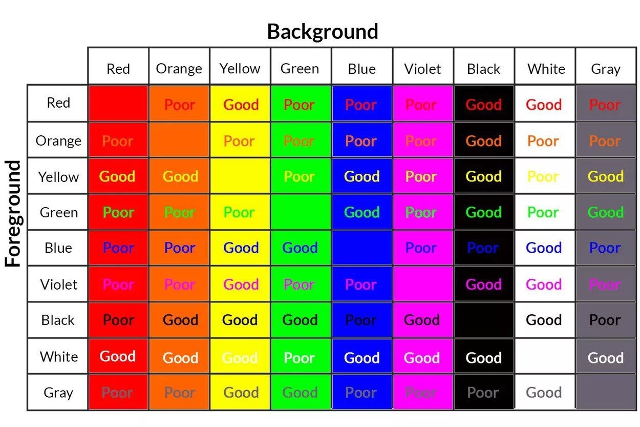
2. Choosing the colors that have low contrast
As mentioned earlier, resume colors with low contrast affect not only the readability but also the parsing of ATS.
See the table below for the best color combinations for your resume:
3. Using pale on pale
Note that your resume/CV may be printed out in black and white. Thus, DO NOT use pale fonts on pale backgrounds as it will be printed out very similarly and will be very hard to read.
4. Overusing colorful or quirky graphics
Making an ATS-friendly resume can't be stressed enough. If overused, graphics can cause your resume to get rejected right in the first place.
5. Adopting different colors with the cover letter
Last but not least, match your resume to your cover letter in terms of color schemes, font sizes, and font types. That will make your application look as consistent and professional as possible.
🔑 Key Takeaways:
- All things considered, resume colors can help your application look more appealing and unique. How to choose colors to use in a resume depends on what industry you're working in and what role you're applying for.
- It might be confusing when selecting professional colors for a CV/resume. Some elements you need to pay attention to include: CV color scheme, resume background color, resume font color, etc.
--- Originally written by May Luong ---
More Career and Recruitment Resources


With the intention of helping job seekers to fully display their value, CakeResume creates an accessible free resume/CV/biodata builder, for users to build highly-customized resumes. Having a compelling resume is just like a piece of cake!