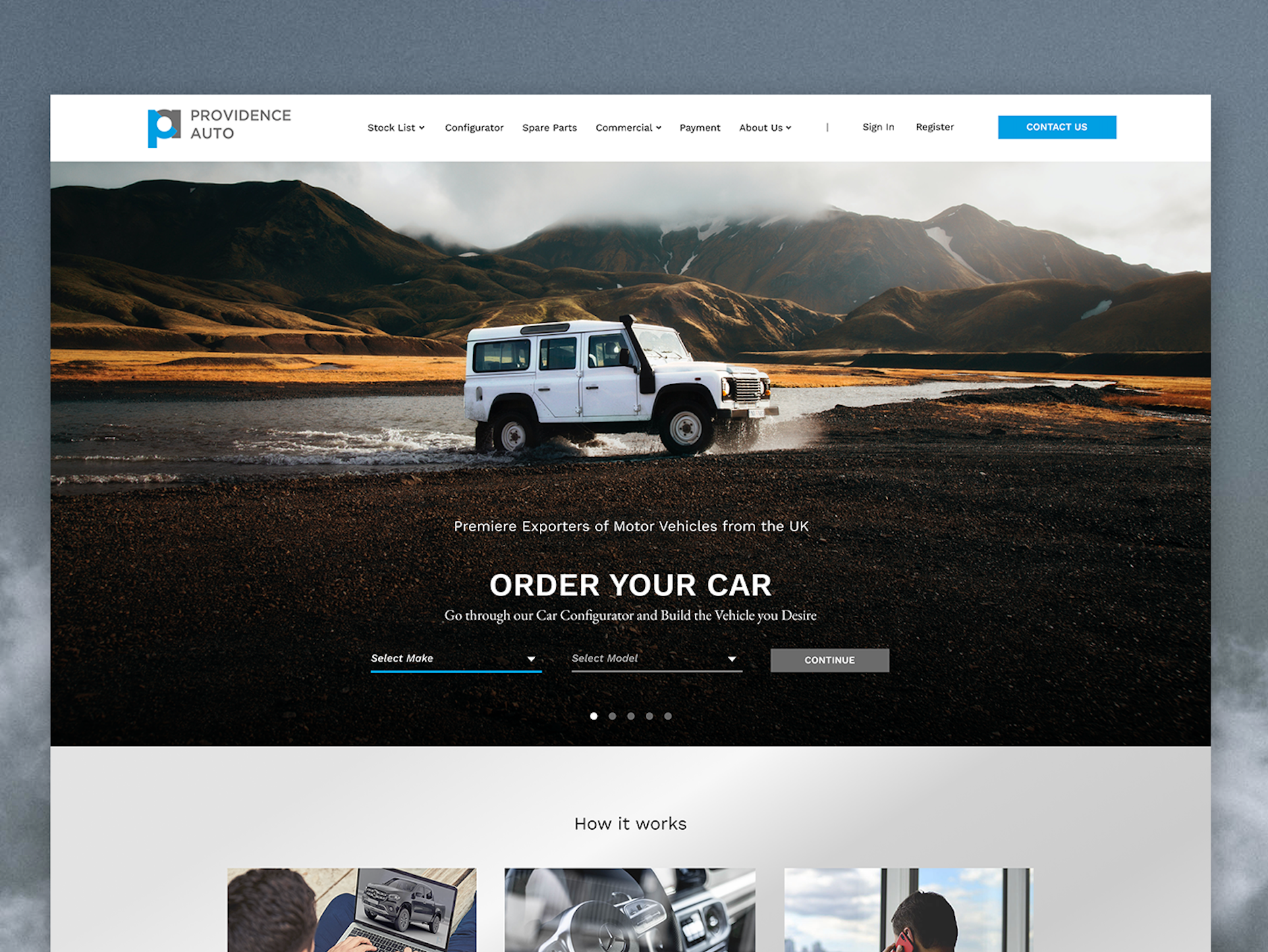
- Jobs
 ResumeCreate your job-winning resume using our free resume builder.
 PortfolioShowcase your skills and projects with a professional portfolio.ResumeCreate your job-winning resume using our free resume builder.Resume BuilderMake a resume for free.Resume TemplatesAccess our extensive library of professional & ready-to-use templates.Resume ExamplesGet inspired by real resume examples to create your own.Occupation GuideAccess resume writing guides tailored for different professions.Resume HelpGet expert advice on all things resume from our team of recruitment specialists.
- ResourcesSuccess StoriesBusiness ExcellenceAbout CakeResumeFeatured Reads
- Hire
- Download our App


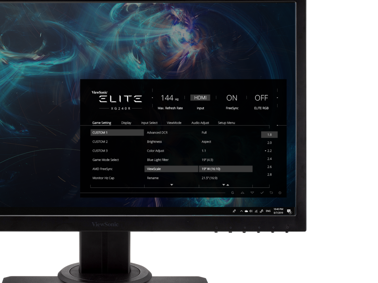
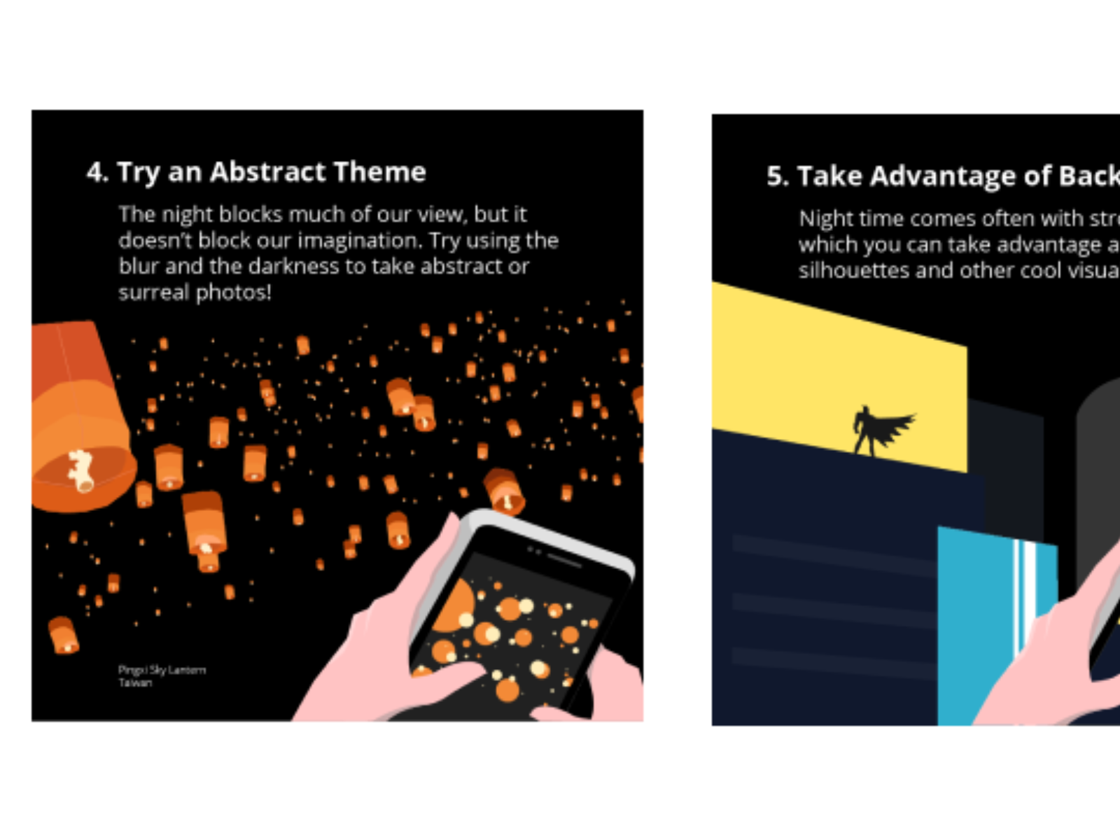
Social Media Art - ViewSonic Corp

Social Media Art - ViewSonic Corp
Senior Graphic Designer
・
New Taipei City, Taiwan
Find more images here:
https://ryanmctang.com/social-art-style.html
There were more than 10 social media accounts under ViewSonic but there were no communication or management before Digital Marketing Team stepped in. Other than eliminating worthless (literally) accounts to speak through one voice, the graphics and arts will also need to be in check and aligned. Given limited resources and the lack of photography support, we decided to go for simple colour blocks, geometric shapes, and texture-free pastel colours in creating illustrated visuals so that we can work faster.
I defined the colours, art style, layout, and typography in a multi-page guidelines for this project. Lots of factors were taken into consideration since these graphics will be reused (evergreen), modified, and translated.
ViewSonic prides in its colour technologies therefore colours is a crucial factor in the arts made for it, so it's a constant challenge for designers to find good balance between colours in an artwork. I believe by using pastel colours, more tolerance and buffer is provided for designers when choosing colours.
Please login to comment.