- Jobs
 ResumeCreate your job-winning resume using our free resume builder.
 PortfolioShowcase your skills and projects with a professional portfolio.ResumeCreate your job-winning resume using our free resume builder.Resume BuilderMake a resume for free.Resume TemplatesAccess our extensive library of professional & ready-to-use templates.Resume ExamplesGet inspired by real resume examples to create your own.Occupation GuideAccess resume writing guides tailored for different professions.Resume HelpGet expert advice on all things resume from our team of recruitment specialists.
- ResourcesSuccess StoriesBusiness ExcellenceAbout CakeResumeFeatured Reads
- Hire
- Download our App


13WAVES

13WAVES
插畫,平面,混音,設計,動畫
・
Taiwan

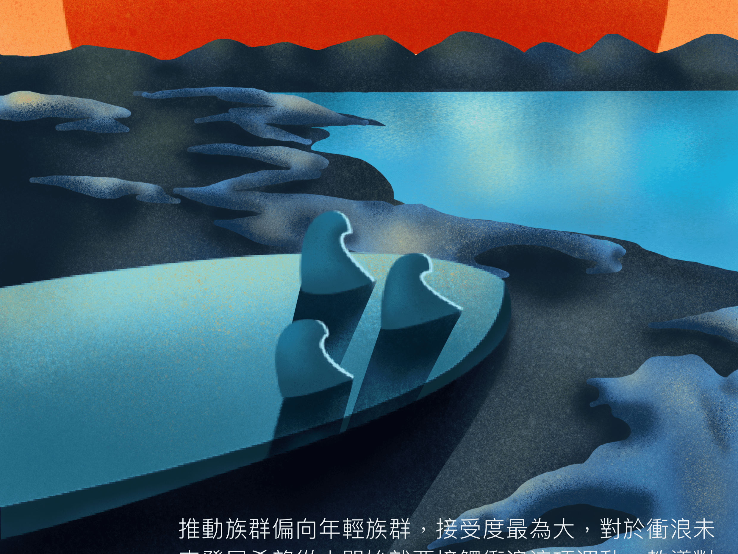
以臺灣衝浪點地方意象做為包裝設計與裝幀概念,透過包裝鏤空與圖像、色彩搭配, 呈現衝浪運動冒險、積極、熱情的運動觀, 凸顯包裝視覺的層次感與韻味,充分傳達衝浪運動活力。
With the local image of surfing spots in Taiwan as the packaging design and binding concept, packaging carving, image and color schemes are used to present the adventure, positivity and enthusiasm from surfing, highlight the layers of packaging and lasting appeal, and fully convey the vitality of surfing.
TAIWAN SURFING PROMOTION
Please login to comment.